A release note from every merge, and a site that sells it to the world.

This is how we build a website for a software startup, step by step, on a sample product: Petek, a fictional tool that drafts a release note from every merge. Seven chapters, from the audience to the live site. This time English comes first, the way an Israeli startup sells to the world.

Sample project · fictional business. The business on this page is fictional. We made it up to show how we work, so there is no client here, and no reviews or results. The steps, the decisions and the work are real: this is how it goes when we work on your business.
The home page of Petek
petek

A note for every merge. Nothing goes public until someone approves.

Software startup

The business and its audience

Before any colour or word: who the business is, who it talks to, and what those people need to find on the site.

A five-person team in Tel Aviv builds a tool for product teams that ship every week. Within minutes of each merged pull request, Petek drafts a release note and puts it in the team's review queue. Someone edits it and presses Approve, and only then does the public changelog update itself. Most teams publish on a fixed day, and Tuesday is the default.

Who it's for

  • Open-source maintainers, who are also the only approvers
  • Product teams: engineers merge, the product manager approves
  • Support teams who need to know what changed before a customer asks
  • Companies with several products, each with its own changelog

What they need to find on the site

  • See the product itself at once, without reading paragraphs of marketing
  • Know that no note goes public before a person approves it
  • Know what the tool reads from the code, and what it never touches
  • A price by who they are, and one button that opens a free workspace

A brainstorm on the name

First we read the market: how businesses in the field name themselves. Then three concepts, and a few names out of each. We check that no business in Israel already has the name, and go on with one.

We read the names of twenty startups, most of them Israeli. The dominant pattern in developer tools is a short invented word of one or two syllables. After it comes a plain English word, sometimes with a clever domain, and a Hebrew word that sounds natural in English too. Founders' names have almost disappeared, and two-word names now sound like an older company.

  1. Concept 1: Taken

    Release notes from merged work

    A tool that drafts a release note from each merged pull request. A person edits and approves, and the public changelog updates itself. Its world: the merge, the review queue and Tuesday's changelog.

    • Petek פֶּתֶקA Hebrew word that reads naturally in English: the small note left on a desk
    • Afterword AfterwordAn English word: the note that comes after the work
  2. Concept 2: Not taken

    The handoff between Tel Aviv and New York

    At five in the afternoon Israel time, the tool gathers the open incidents and pull requests, writes the handoff and sends it to whoever is on call in New York. In the morning, the same in reverse.

    • Overlap OverlapThe hours the two time zones share
    • Shomer שׁוֹמֵרThe guard, the night watch, a word English speakers know
  3. Concept 3: Not taken

    Right-to-left, done right

    A tool that checks right-to-left layouts in Hebrew, Arabic and Persian: it screenshots every screen mirrored, flags the direction bugs and opens a fix. Israel knows this problem better than anyone.

    • Yamin יָמִין'Right', two syllables, easy in English
    • Bidi BidiThe engineers' word, short and playful, but a generic term that is hard to own

Why

The clearest idea of the three concepts, and the easiest to show: the product itself is the note. The name is Hebrew, two syllables, and sounds natural in English, like the Israeli startups that hide a Hebrew word inside an international name. We checked: no software company goes by it.

Two more names fell at the check: one already belongs to an Israeli scheduling product, and another is carried by several release-notes tools.

Inspiration

We put the field's best sites on the table, from outside Israel, and choose one whose pace and structure fit the idea. We measure it with our own tool, and build on it in our own code, photos and words.

On the table

  • AttioLondonTabs by role that swap the product screen
  • Cal.comSan FranciscoPricing and questions inside the home page's scroll
  • RaycastLondonA drawing of a device whose keys light up per feature

These sites are inspiration only, and have no connection to us or to the fictional business. Each name links to the site itself.

The inspiration we chose

Linear San Francisco · linear.app

A product development tool whose site became the standard for software sites

The product is the hero: the site shows the interface itself on a dark ground, precise and quiet. And it has a dated changelog on the home page, proof that the product moves every week. That is exactly what Petek sells.

We measured Linear with our own tool, on five pages at three screen widths: the order and height of every section, the type scale, the spacing, the colours, the buttons and the motion. The night follows Doppler and the day Seline. We build on the structure; we don't copy it: no line of their code, no image, typeface or word of theirs is in the site.

What we took, in words

  • An opening headline on two lines, with the product in a large window under it
  • One sentence whose second half is grey
  • Three benefits, each with a small drawing of the interface
  • Numbered sections in two columns, with a large screen below
  • A dated changelog strip on the home page
  • One large closing line, a button, and a six-column footer

What we made our own

  • The product is drawn in code, not photographed: the review queue, an open note with a folded corner, and the Approve button
  • Instead of customer logos we don't have: a quiet line about what the product connects to
  • Instead of customer stories: pricing and questions inside the home page, by who you are
  • The folded slip is the logo, the caret in the editor and the bullet of every changelog entry
  • English first, and a Hebrew page that tells what a petek is
  • Support hours in Israel time, and no invented numbers or customers

The home page's skeleton, in our own drawing

Our own drawing, at the heights we measured. No screenshot of their site is published here: it's theirs.

  1. 01Theirs: A headline, with the product in a large window under itOurs: 'A note for every merge', and the drawn review queue
  2. 02Theirs: A row of customer logosOurs: A quiet line: works with GitHub, GitLab and Bitbucket
  3. 03Theirs: A sentence half in greyOurs: Every merge leaves a note. You decide which ones the world reads.
  4. 04Theirs: Three benefits with small drawingsOurs: Merge, note, approve
  5. 05Theirs: A numbered section and a large screenOurs: 1.0 The queue, with tabs by role that swap the screen
  6. 06Theirs: A numbered section and a large screenOurs: 2.0 Publish day: the week, with Tuesday marked
  7. 07Theirs: Two more numbered sectionsOurs: Not kept: two are enough for Petek
  8. 08Theirs: A dated changelogOurs: Petek's own notes, with the folded slip as the bullet
  9. 09Theirs: Customer storiesOurs: Pricing by who you are, and questions
  10. 10Theirs: A closing line and a buttonOurs: Start with your next merge
  11. 11Theirs: A six-column footerOurs: Product, resources, the company, and a Hebrew page

The design language

Colour, type and the logo, from the first sketch to the final one. What was turned down stays here too: it shows how we got there.

The colours

  • Cool white #F7F8F8The text at night, and the ground by day18.7:1 on Near black
  • Near black #08090AThe ground at night, the default, and the text by day18.7:1 on Cool white
  • Indigo #4B55C9The same colour by day, deeper so it reads on white5.7:1 on Cool white
  • Night indigo #7C85E6The one colour: the folded corner, the Approve button, the current tab6:1 on Near black
  • Night grey #8A8F98Secondary text at night6.1:1 with text in Near black
  • Grey #5E6169Secondary text by day5.8:1 with text in Cool white

As on the inspiration site: near black, white and grey, with violet-indigo only as a touch. In round one the night was plum, from the gradient photo; on the approved board it cooled to Linear's black, and the violet deepened to indigo and stayed only in the folded corner and the Approve button. Night is the default, as on software sites.

The type

  • A note for every merge.Onest 600Latin, the main face of an English-first site: a clean grotesque with Linear's even rhythm, but not Inter
  • פתק לכל מיזוג.Rubik 400Hebrew: its Hebrew was designed with its Latin, and its soft corners read as software

Linear is set in Inter, the typeface of half the internet. We chose a face with the same quiet rhythm that is not Inter, so Petek wouldn't look like one more software site. In Hebrew we didn't imitate the Latin: Rubik speaks its own way, and in the large headlines it is lighter.

The logo, from sketch to final

  1. Day
    Night

    Round one, 14.11

    A slip in plum

    The square slip with its folded corner, filled with the panel colour, the fold a violet line. Under it petek and פתק, on a dark plum ground.

    The slip stayed. The plum cooled to the inspiration site's black, and the fold was filled with colour so it still shows at the size of a bullet.

  2. Day
    Night

    Approved, 15.11

    A slip with a folded corner

    A square slip in one line, its top corner folded and filled in indigo, beside petek in tight Onest. On the site it is also the blinking caret in the drawn editor, and the bullet of every changelog entry.

Photos

Every photo has a job: something it has to say. First we write a direction and a shot list, and only then search: one series, in one light, under an open licence.

The direction, before the search

  • The product is the picture: the interface is drawn in code, not screenshots
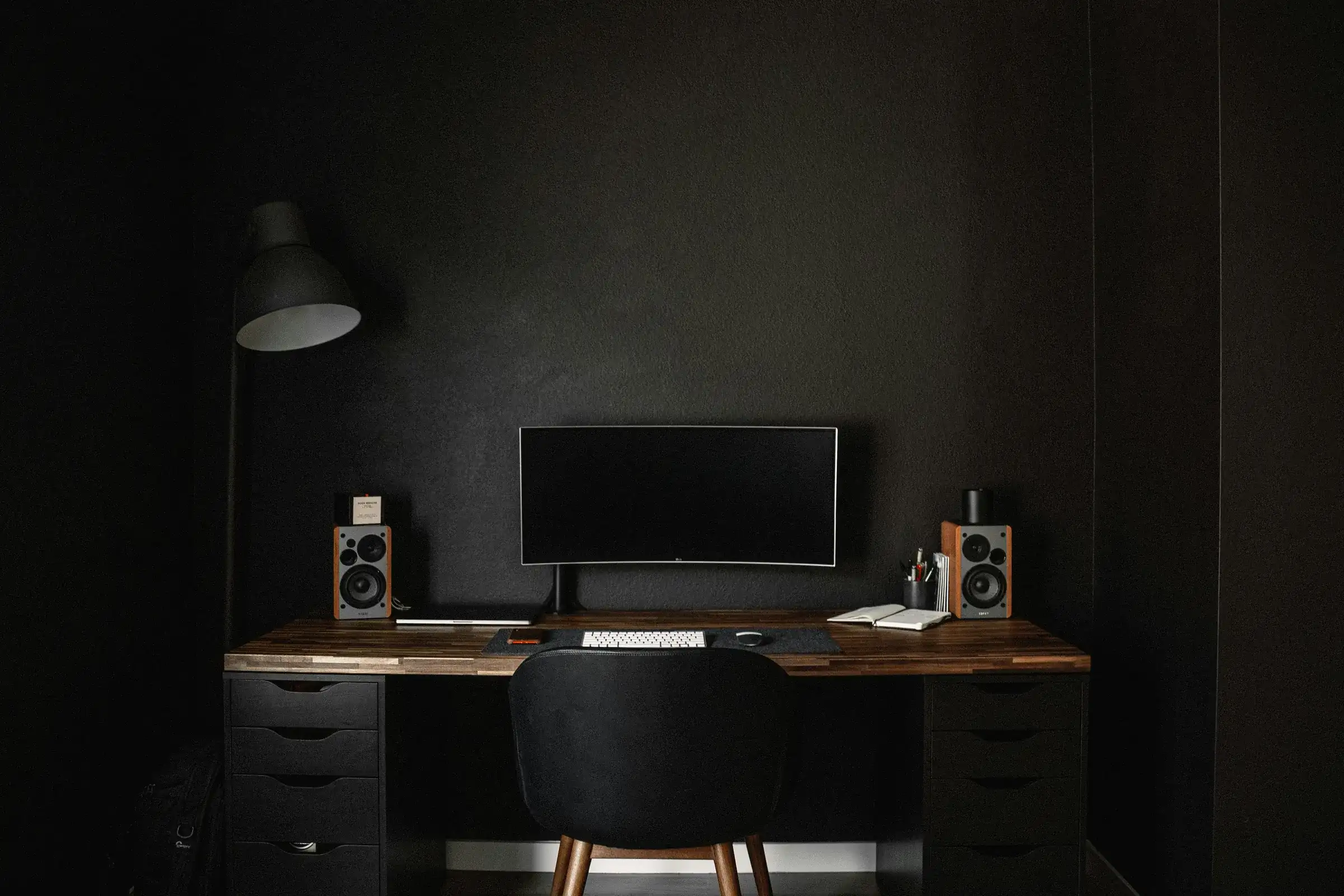
  • Photos only for mood and the team: darkness and one soft light, a screen or a lamp
  • A world of a calm desk: a keyboard, wood or concrete, no office anyone would know
  • People: hands only, or a silhouette. No faces
  • No readable text: no code, no logo, no words on a board

What each photo says

How we chose

  • Only licences open for commercial use, and every photo is logged with its photographer and the link to its page
  • The dark half of the set matches: two photographers, the same kind of desk, lamp and screen
  • Two photos of a whiteboard and sketches stayed out: one is a growth arrow, and the other has readable words across the page
  • The wallpaper on the screen was blurred by a script, not by AI, and a poster with lettering was cropped away
  • A violet gradient that stood behind the product window came off in the design review: the window stands on a plain ground

Words

One voice for the whole brand, and a few lines that show it. Here the English is written first, because the product sells to the world; the Hebrew is written for its own reader, never translated word for word.

The voice

Short, concrete and product-first. It always names the person who approves, and never promises speed or numbers.

Three lines

  1. Merge on Tuesday, and the note is in your queue on Tuesday. Nothing goes public until someone presses Approve.מיזגתם ביום שלישי? הפתק מחכה בתור באותו יום. שום דבר לא מתפרסם בלי אישור.
  2. Connect a repository, pick a branch, choose who approves. No code changes.מחברים מאגר, בוחרים ענף, וקובעים מי מאשר. בלי לשנות קוד.
  3. Every merge leaves a note. You decide which ones the world reads.כל מיזוג משאיר פתק. אתם מחליטים מה העולם קורא.

The site

The live site, in Hebrew and English, by day and by night, with a privacy policy, an accessibility statement and a consent box on every form.

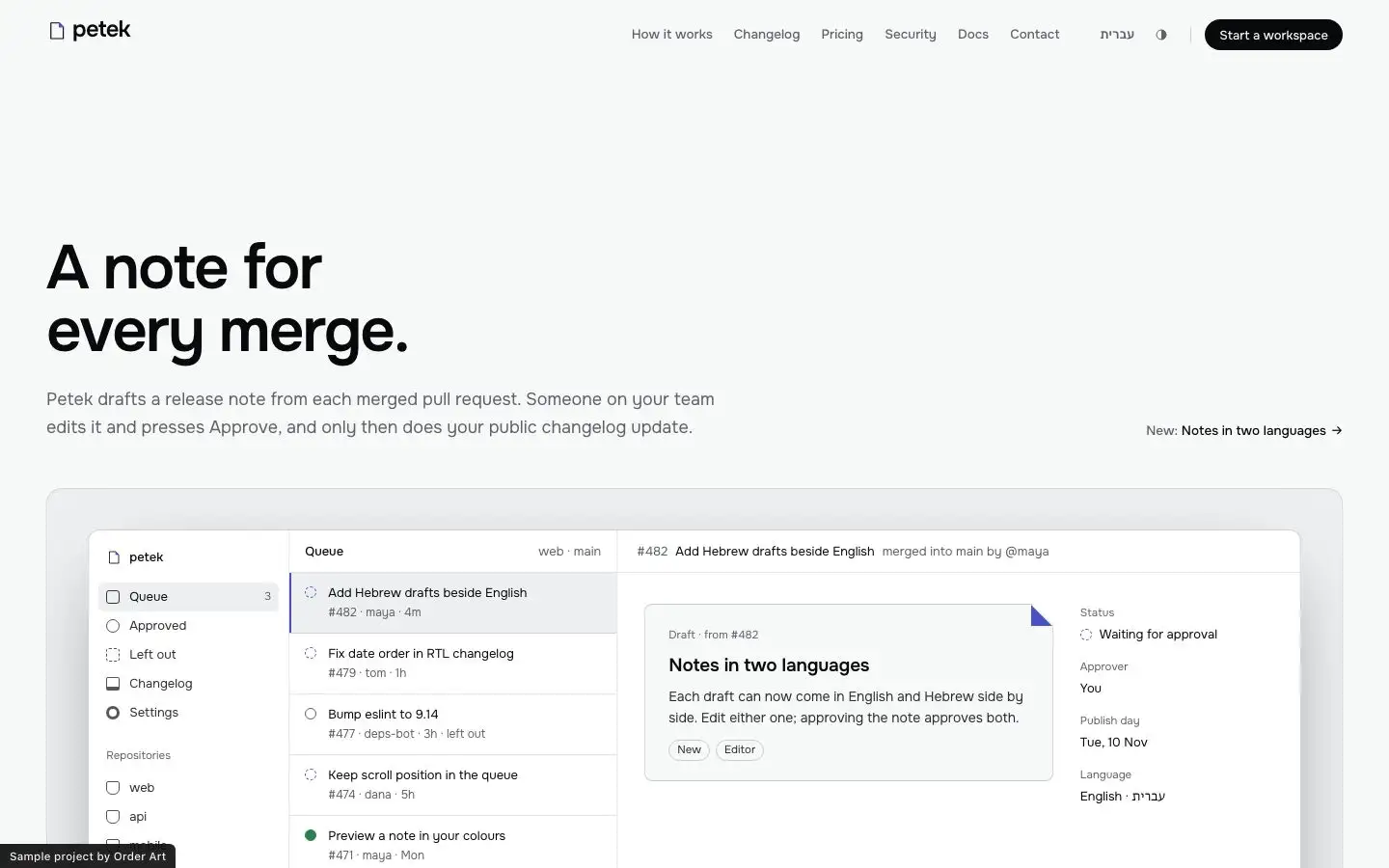
The home page of Petek in day mode
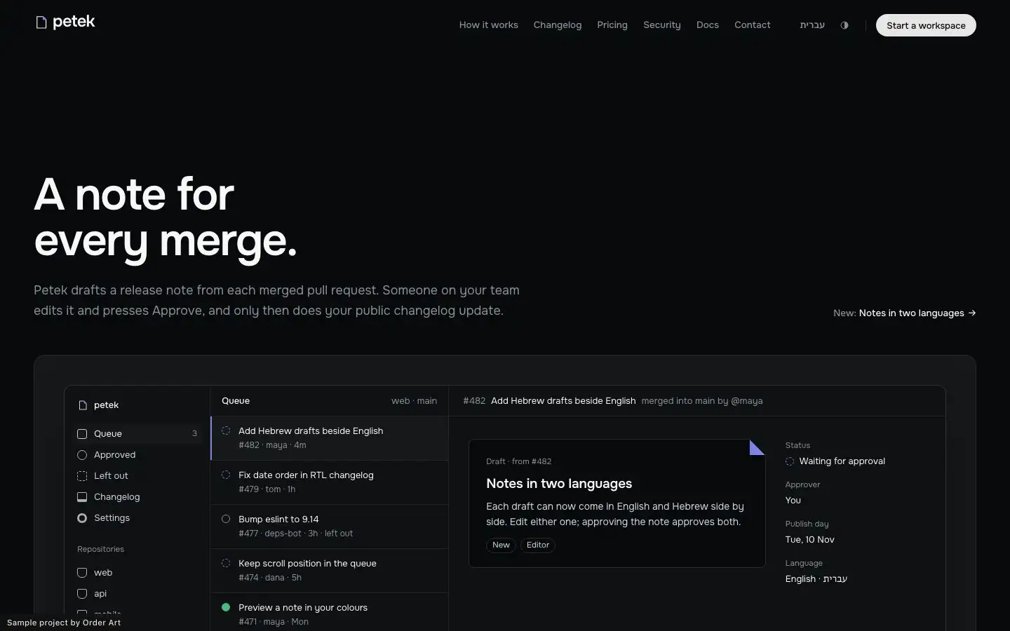
The home page of Petek in night mode
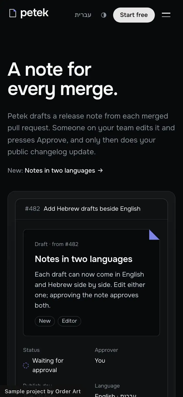
The home page of Petek on a phone
The home page, by day, by night and on a phone

The site in English: PetekThe site in HebrewThe sample site stays out of search.

The pages, in each language

  1. How it works
  2. Changelog
  3. Pricing
  4. Security
  5. Docs
  6. Contact
  7. About
  8. Start a workspace
  9. Privacy
  10. Accessibility

What the site has

  • English first and Hebrew, night mode and day mode
  • The product drawn in code wherever a software site would put a screenshot
  • Forms to start a workspace and to write to the team that behave like the real thing, then say plainly that this is a sample site and nothing was sent
  • A privacy policy, an accessibility statement to Israeli Standard 5568, and an unticked consent box on every form
  • No customers, no reviews and no invented numbers: the proof is the changelog
  • The sample site stays out of search, so a fictional product never shows up on Google as if it were real

Want us to take your business through these seven steps?

Two fields, and we'll send you information about what interests you.

Request for informationORDER ART · Nº 0001
What interests you? (optional)

The button opens your e-mail with the message written. Nothing is stored on this site.