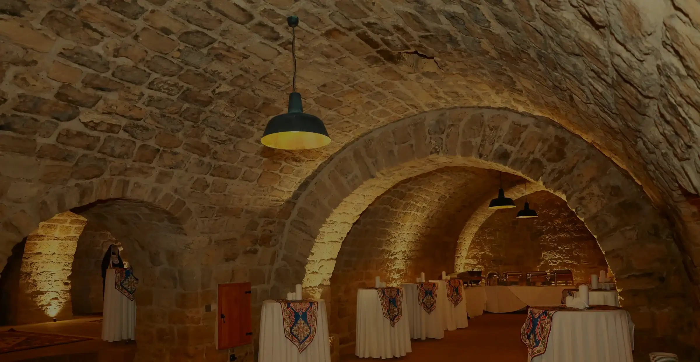
A wine bar under the stones of Jaffa.

This is how we build a restaurant website, step by step, on a sample business: Volta, a fictional wine bar in a stone vault in Jaffa. Seven chapters, from the audience to the live site.

Sample project · fictional business. The business on this page is fictional. We made it up to show how we work, so there is no client here, and no reviews or results. The steps, the decisions and the work are real: this is how it goes when we work on your business.
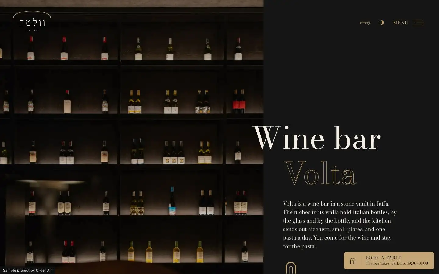
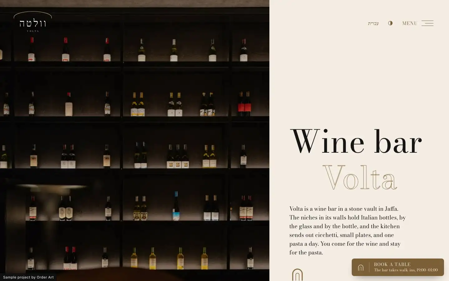
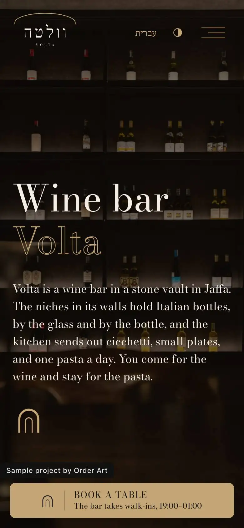
The home page of Volta
וולטהVOLTA

Italian wine and one pasta a day, in a stone vault in Jaffa.

Restaurant and wine bar

The business and its audience

Before any colour or word: who the business is, who it talks to, and what those people need to find on the site.

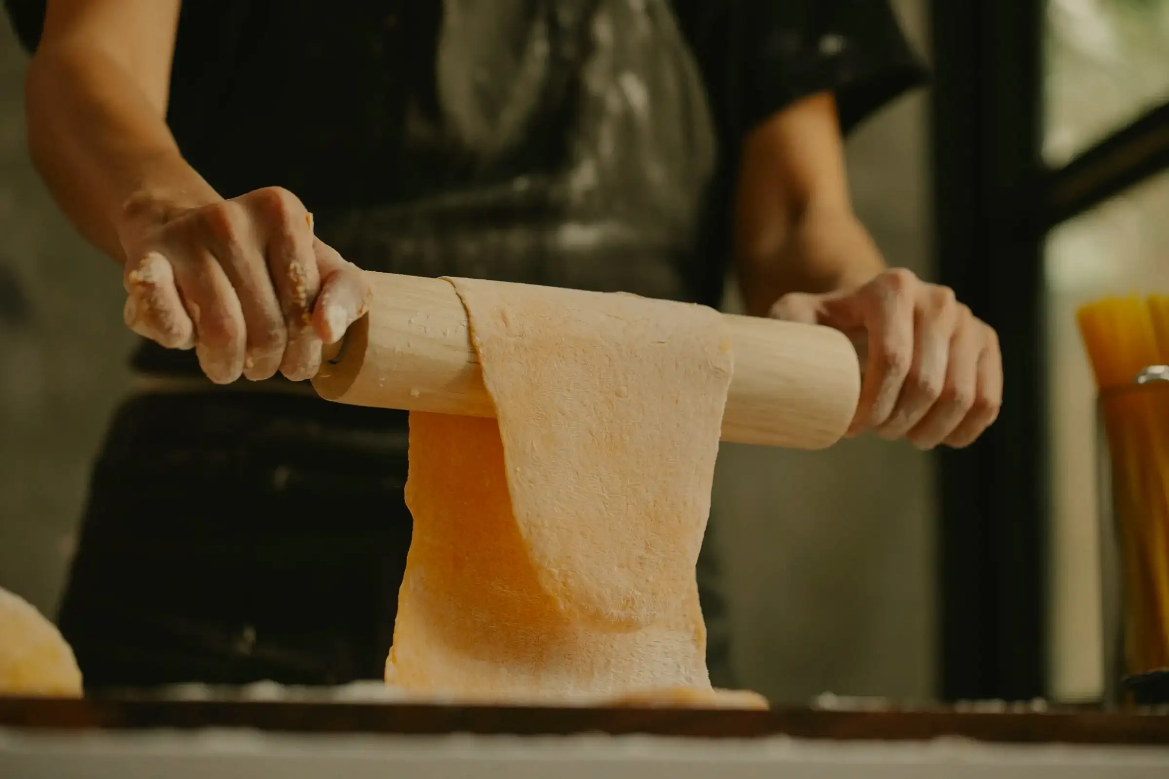
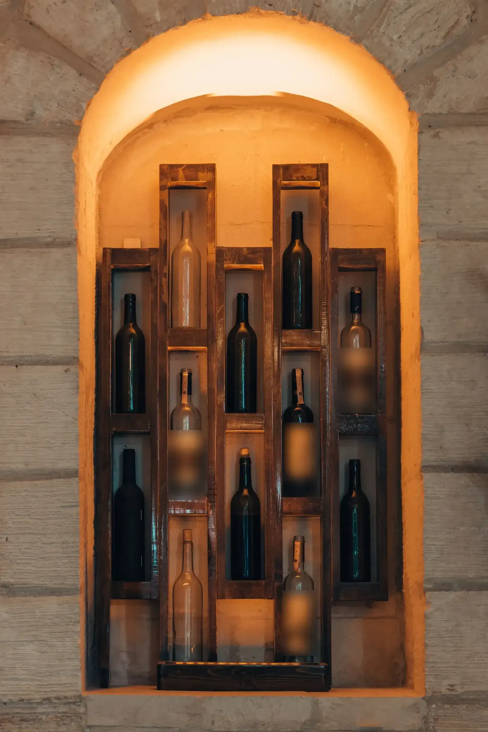
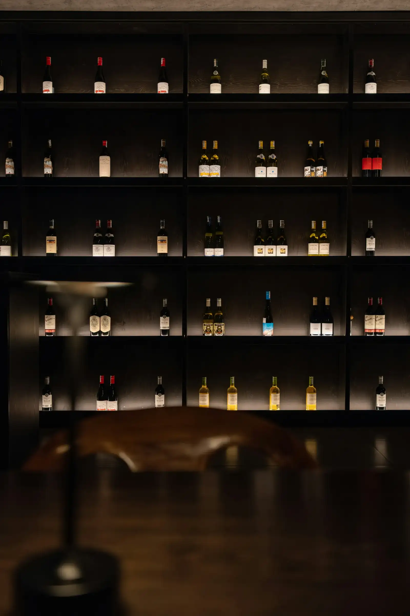
A sommelier and a pasta cook take over an old stone vault in Jaffa and fill the niches in its walls with Italian bottles, by the glass and by the bottle. The kitchen sends out cicchetti, small plates, and one pasta a day, rolled in the afternoon. When it's gone, it's gone. Doors open at seven, and the last glass is poured at one.

Who it's for

  • People who come for the wine and stay for the pasta
  • Couples and friends after a long, quiet evening, not a quick meal
  • Walk-ins at the bar, and people who book a table in the vault ahead
  • Groups who want a private evening around one table

What they need to find on the site

  • Book a table in one tap, with the rule right beside it: the bar takes walk-ins
  • The wine list by region, with a price by the glass and by the bottle
  • Hours, address and WhatsApp, and a plain line saying the place is not kosher
  • Private evenings: what's possible, for how many, and how to ask

A brainstorm on the name

First we read the market: how businesses in the field name themselves. Then three concepts, and a few names out of each. We check that no business in Israel already has the name, and go on with one.

We read the names of about 20 Italian places in Israel and nine of the best abroad. Five ways come back again and again: a host's or a grandmother's first name, an Italian word for the kind of place or dish, an address or a street, a playful Hebrew–Italian mash, and an Italian exclamation. Almost no Italian place in Israel takes a Hebrew word: they write an Italian word in Hebrew letters, with a Latin logo.

  1. Concept A: Not taken

    The one oven

    A chef couple and a small Italian kitchen around one wood oven. The fire is lit at five, and everything passes it: the bread, the vegetables, the fish.

    • Gahelet גחלתA Hebrew word, against the grain on purpose: the ember is the whole idea
    • La Brace לה בראצ'ה'Over the embers', said the way the market names itself
  2. Concept B: Not taken

    A Jewish-Roman osteria

    The food of a grandmother born in Rome's Jewish quarter, now cooked by her grandson. Artichokes, olive oil, a chalkboard and family photos.

    • Da Rina דה רינה'At Rina's': a name that is both Italian and Israeli
    • Nella נלהShort and warm, easy to say in Hebrew
  3. Concept C: Taken

    A wine cellar in a vault

    A sommelier and a pasta cook in a stone vault. Two hundred labels on the walls, cicchetti, and one pasta a day. Open at seven, closed at one.

    • Volta וולטה'La volta' is the vault; 'una volta' means 'once upon a time'
    • Cin Cin צ'ין צ'יןThe Italian toast: playful, but close to the cheap end

Why

Of the three concepts, the cellar fits the night and gold of the inspiration site best, and the photos of wine, bottles and candles. And the name works the way the market does: an Italian word for the place itself, saying the room and the long evening at once. We checked: no bar or restaurant in Israel goes by it.

Two more names fell at the check: one is already used by a bar in the city, and one sounds like an army-base canteen in Israeli Hebrew.

Inspiration

We put the field's best sites on the table, from outside Israel, and choose one whose pace and structure fit the idea. We measure it with our own tool, and build on it in our own code, photos and words.

On the table

  • SeptimeParisA whole restaurant on one calm page, with the booking rule beside the button
  • KOLLondonShort and confident: text and wide images in turns
  • NomaCopenhagenBig images, few words, one button a block
  • DishoomUKA warm story, and two opening buttons: the menu and booking
  • DéliceCanadaAn Awwwards honourable mention, 2026
  • ViseversaPortugalAn Awwwards honourable mention, 2024

These sites are inspiration only, and have no connection to us or to the fictional business. Each name links to the site itself.

The inspiration we chose

GEM. the Netherlands · restaurantgem.com

An Awwwards nominee, 2025; a restaurant with two Michelin stars

Night photography, a split opening screen with a thin serif on black, one muted gold, and a 'book a table' button that never leaves the screen. Exactly the pace of a wine bar that opens at seven.

We measured GEM. with our own tool, on seven pages at three screen widths: the order and height of every section, the type scale, the spacing, the colours and the motion. We build on the structure; we don't copy it: no line of their code, no image, typeface or word of theirs is in the site.

What we took, in words

  • A split opening screen: a photo on one side, the name in a thin serif on black on the other
  • Two-word headings: the first word solid, the second in outline only
  • A band of large outlined words that slides as you scroll
  • A gold booking button floating in the corner, on every page and every width
  • Square corners, no shadows, no gradients: black, ivory and gold
  • 240 pixels between sections on a desktop, 80 on a phone

What we made our own

  • Hebrew first, right to left: what sits on their left sits on our right
  • Our arch in place of their two stars
  • Instead of an Instagram feed, 'this week in the niches': three of our photos, no counts, no fake posts
  • Instead of the awards row: the opening hours and the kashrut line
  • Our own booking page instead of a third-party widget, with a consent box
  • The motion stops when the visitor asks for less motion

The home page's skeleton, in our own drawing

Our own drawing, at the heights we measured. No screenshot of their site is published here: it's theirs.

  1. 01Theirs: A split openingOurs: The bottle wall, and Volta under its arch
  2. 02Theirs: A sliding bandOurs: Volta · Italian wine · one pasta a day
  3. 03Theirs: A statement and floating photosOurs: Two hundred bottles in the niches
  4. 04Theirs: A wide photo, a heading in its cornerOurs: One pasta a day
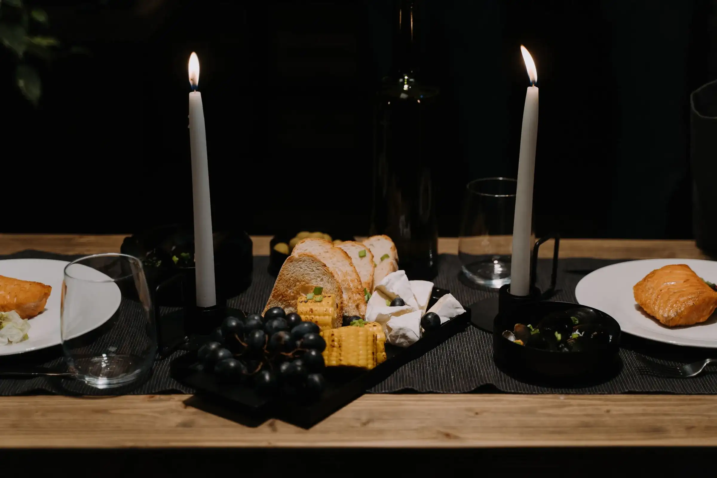
  5. 05Theirs: Three dishes and a changing photoOurs: The cicchetti, in an arch frame
  6. 06Theirs: A large paragraph and two cardsOurs: The vault and the long table
  7. 07Theirs: The band againOurs: In the other direction
  8. 08Theirs: A newsletter sign-upOurs: The week's bottles, with a consent box
  9. 09Theirs: Three Instagram postsOurs: This week in the niches
  10. 10Theirs: A three-column footerOurs: Hours, kashrut and address

The design language

Colour, type and the logo, from the first sketch to the final one. What was turned down stays here too: it shows how we got there.

The colours

  • Ivory #F3EDE3The ground by day, the text at night15.7:1 on Vault
  • Vault #151515The ground at night, the text by day15.7:1 on Ivory
  • Cork #8A6A3EThe day's gold, dark enough for ivory: the arch, rules and large headings4.3:1 on Ivory (large text only)
  • Candle #C4A676The night's gold: the arch, the links and the booking button7.9:1 on Vault

The colours come from measuring the inspiration site: black, ivory and one muted gold. Night is the default, because the bar is only open at night; by day the gold darkens so it reads.

The type

  • פותחים בשבע.Frank Ruhl Libre 300Hebrew: thin headings at weight 300, text at 400
  • Barolo, PiemonteBodoni Moda 400 italicLatin and Italian, in italic for every Italian word: the wines, the regions, the cicchetti

Bodoni was a printer from Parma, and his letter, with its sharp contrast of thick and thin, looks like an Italian wine label. Frank Ruhl Libre is a Hebrew serif in the same spirit, so the Hebrew never looks like a weak copy of the English.

The logo, from sketch to final

  1. Day
    Night

    The first seed

    Gahelet and a dot

    The name in a thin serif, followed by one gold dot: the ember.

    Turned down: when the concept moved from the oven to the cellar, the name and the dot went together.

  2. Day
    Night

    Round one, 14.11

    The arch

    One thin gold arch over the name, a little wider than the word: the vault. The icon: one arch.

    The arch and the type stayed. The cellar's browns went, and so did the single-arch icon.

  3. Day
    Night

    Approved, 15.11

    Volta

    The colours moved to the inspiration site's black, ivory and muted gold, and the icon gained a second arch: the vault and its doorway. The arch alone is the favicon, the stamp on the bill, the bottle tag and the end of the wine list.

Photos

Every photo has a job: something it has to say. First we write a direction and a shot list, and only then search: one series, in one light, under an open licence.

The direction, before the search

  • The light: night, and warm. Tungsten and candles, deep shadow, highlights like brass
  • The world: a working Italian kitchen and a room after dark. Flour, pasta, wine, marble and wood
  • The camera: close. Hands at work, food from the side and from above
  • People: hands, backs and silhouettes. No faces, because a fictional business must not look as if it had real staff or guests
  • A series before beauty: two shoots by two photographers carry 12 of the 22 shots

What each photo says

How we chose

  • Only licences open for commercial use (Unsplash and Pexels), and every photo is logged with its photographer and the link to its page
  • No photo was taken in Israel, and none shows a place anyone here would know. One was turned down because its page tagged Jerusalem
  • When the concept moved from the oven to the cellar, the oven shot left the set
  • Colour is matched by a script, not by AI: the vault was darkened a stop and warmed, and a sign and labels were blurred

Words

One voice for the whole brand, and a few lines that show it. The Hebrew is written first; the English is written for its own reader, never translated word for word.

The voice

Late, quiet and exact. The hour and the glass, instead of 'experience'. Short sentences: no superlatives, no reviews, no numbers that promise a result.

Three lines

  1. We open at seven. Last glass at one.פותחים בשבע. הכוס האחרונה באחת.
  2. One pasta a day. We roll it in the afternoon, and when it's gone, it's gone.פסטה אחת ביום. מגלגלים אותה אחר הצהריים, וכשהיא נגמרת היא נגמרת.
  3. The bar takes walk-ins. For a table in the vault, it's worth booking.על הבר בלי הזמנה. לשולחן בקמרון כדאי להזמין.

The site

The live site, in Hebrew and English, by day and by night, with a privacy policy, an accessibility statement and a consent box on every form.

The home page of Volta in day mode
The home page of Volta in night mode
The home page of Volta on a phone
The home page, by day, by night and on a phone

The site in English: VoltaThe site in HebrewThe sample site stays out of search.

The pages, in each language

  1. Home
  2. Wine list
  3. Menu
  4. The vault
  5. Hours & finding us
  6. Private evenings
  7. Book a table
  8. Privacy
  9. Accessibility

What the site has

  • Hebrew and English, day mode and night mode
  • A booking form that behaves like the real thing, then says plainly that this is a sample site and nothing was sent
  • A privacy policy, an accessibility statement to Israeli Standard 5568, and an unticked consent box on every form
  • Lighthouse 97 to 100 for performance and 100 for accessibility, on phone and desktop
  • The sample site stays out of search, so a fictional restaurant never shows up on Google as if it were real

Want us to take your business through these seven steps?

Two fields, and we'll send you information about what interests you.

Request for informationORDER ART · Nº 0001
What interests you? (optional)

The button opens your e-mail with the message written. Nothing is stored on this site.